정보관리(Dashboard)
- 보고서 생성: 재고 현황, 입출고 현황등을 실시간으로 보고서로 생성합니다.
- 통계 및 분석: 데이터를 분석하여 효율적인 창고 운영 전략을 수립합니다.
연습문제 1~2
문제 1 : 다음은 Matplotlib를 이용하여 시각화하는 내용이다 다음의 요구사항에 맞춰 개발을 완료하세요. 또한 입고, 재고, 출고 현황은 하나의 화면에 배치해서 만들고 웹에서 출력할 수 있도록 한다.
(app.py와 dashboard.html로 구현)
- 입고 테이블을 읽어서 입고현황 Chart로 만드세요.
- 재고 테이블을 읽어서 재고현황 Chart를 만드세요
- 출고 테이블을 읽어서 출고현황 Chart를 만드세요.
app.py
from flask import Flask, render_template, url_for, send_from_directory
import mysql.connector
from mysql.connector import Error
import os
import matplotlib.pyplot as plt
import pandas as pd
from matplotlib.backends.backend_agg import FigureCanvasAgg as FigureCanvas

app = Flask(__name__)
app.config['UPLOAD_FOLDER'] = 'static/images'

def create_connection():
    connection = None
    try:
        connection = mysql.connector.connect(
            host='localhost',
            user='joon',
            password='1234',
            database='backend'
        )
    except Error as e:
        print(f"Error: '{e}'")
    return connection

def fetch_data(query):
    connection = create_connection()
    if connection is None:
        return []

    try:
        cursor = connection.cursor(dictionary=True)
        cursor.execute(query)
        records = cursor.fetchall()
        cursor.close()
    except Error as e:
        print(f"Error: '{e}'")
        records = []
    finally:
        connection.close()

    return records

def save_chart(df, filename, title, xlabel, ylabel, id_col, value_col, color='blue'):
    if not os.path.exists(app.config['UPLOAD_FOLDER']):
        os.makedirs(app.config['UPLOAD_FOLDER'])

    fig, ax = plt.subplots(figsize=(4, 3))  # 이미지 크기 조정
    ax.bar(df[id_col].astype(str), df[value_col], color=color)
    ax.set_title(title)
    ax.set_xlabel(xlabel)
    ax.set_ylabel(ylabel)
    ax.set_xticklabels(df[id_col].astype(str), rotation=0)
    fig.tight_layout()

    canvas = FigureCanvas(fig)
    img_path = os.path.join(app.config['UPLOAD_FOLDER'], filename)
    canvas.print_figure(img_path)

    return img_path

@app.route('/incoming_chart')
def incoming_chart():
    query = "SELECT id, product_quantity FROM incoming_ex"
    records = fetch_data(query)
    df = pd.DataFrame(records)

    if not df.empty:
        img_path = save_chart(df, 'incoming_chart.png', 'Incoming Records', 'ID', 'Quantity', 'id', 'product_quantity', color='blue')
        return send_from_directory(app.config['UPLOAD_FOLDER'], 'incoming_chart.png')
    else:
        return "No data available"

@app.route('/stock_chart')
def stock_chart():
    query = "SELECT id, stock_quantity FROM stock_ex"
    records = fetch_data(query)
    df = pd.DataFrame(records)

    if not df.empty:
        img_path = save_chart(df, 'stock_chart.png', 'Stock Records', 'ID', 'Quantity', 'id', 'stock_quantity', color='green')
        return send_from_directory(app.config['UPLOAD_FOLDER'], 'stock_chart.png')
    else:
        return "No data available"

@app.route('/outbound_chart')
def outbound_chart():
    query = "SELECT id, actual_quantity FROM outbound_registration_ex"
    records = fetch_data(query)
    df = pd.DataFrame(records)

    if not df.empty:
        img_path = save_chart(df, 'outbound_chart.png', 'Outbound Records', 'ID', 'Quantity', 'id', 'actual_quantity', color='red')
        return send_from_directory(app.config['UPLOAD_FOLDER'], 'outbound_chart.png')
    else:
        return "No data available"

@app.route('/')
def index():
    incoming_img = url_for('incoming_chart')
    stock_img = url_for('stock_chart')
    outbound_img = url_for('outbound_chart')
    return render_template('dashboard.html', incoming_img=incoming_img, stock_img=stock_img, outbound_img=outbound_img)

if __name__ == '__main__':
    app.run(host='0.0.0.0', port=5001, debug=True)
dashboard.html
<!DOCTYPE html>
<html>
<head>
    <title>Warehouse Dashboard</title>
</head>
<body>
    <h1>Warehouse Dashboard</h1>
    <div>
        <h2>Incoming Chart</h2>
        <img src="{{ incoming_img }}" alt="Incoming Chart">
    </div>
    <div>
        <h2>Stock Chart</h2>
        <img src="{{ stock_img }}" alt="Stock Chart">
    </div>
    <div>
        <h2>Outbound Chart</h2>
        <img src="{{ outbound_img }}" alt="Outbound Chart">
    </div>
</body>
</html>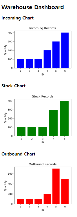
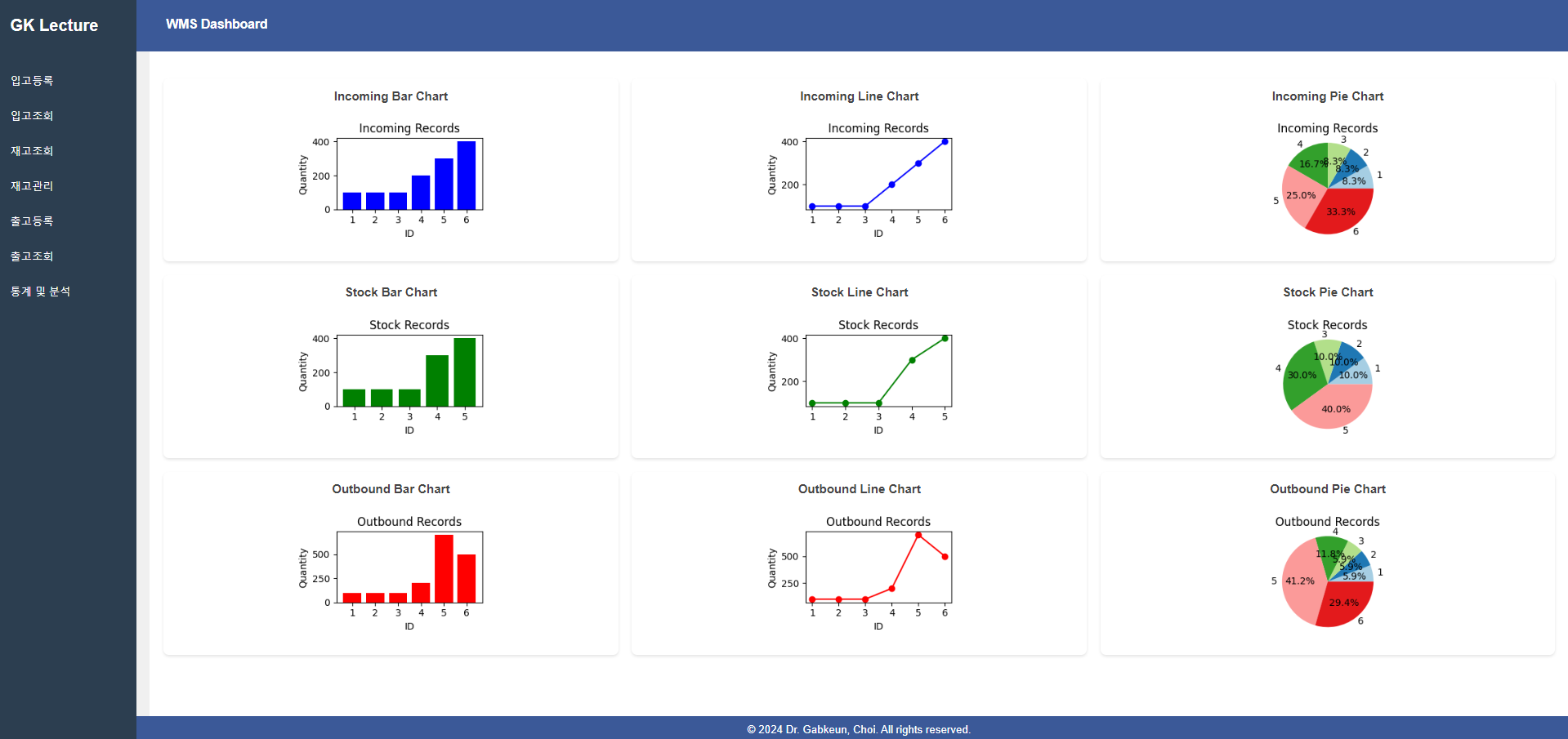
문제 2 : 같은 내용에 대해 그래프를 3종류(파이, 꺽은선, 막대)로 만들고 버튼으로 선택할 수 있도록 하세요.
- 입고, 재고, 출고에 대한 현황을 각각 3종류의 그래프로 그린다.
- 버튼을 선택하면 선택된 종류의 그래프만 출력한다.
app.py (추가)
# 차트 생성 함수
def save_chart(df, filename, title, xlabel, ylabel, id_col, value_col, chart_type='bar', color='blue'):
    if not os.path.exists(app.config['UPLOAD_FOLDER']):
        os.makedirs(app.config['UPLOAD_FOLDER'])

    fig, ax = plt.subplots(figsize=(3, 2))  # 이미지 크기 조정

    if chart_type == 'bar':
        ax.bar(df[id_col].astype(str), df[value_col], color=color)
    elif chart_type == 'line':
        ax.plot(df[id_col].astype(str), df[value_col], color=color, marker='o')
    elif chart_type == 'pie':
        colors = plt.cm.Paired(range(len(df)))  # Use the 'Paired' colormap to get a range of colors
        ax.pie(df[value_col], labels=df[id_col].astype(str), autopct='%1.1f%%', colors=colors)
        ax.axis('equal')  # Equal aspect ratio ensures that pie is drawn as a circle.
        ax.set_title(title)
        fig.tight_layout()
        img_path = os.path.join(app.config['UPLOAD_FOLDER'], filename)
        canvas = FigureCanvas(fig)
        canvas.print_figure(img_path)
        return img_path

    ax.set_title(title)
    ax.set_xlabel(xlabel)
    ax.set_ylabel(ylabel)
    ax.set_xticklabels(df[id_col].astype(str), rotation=0)
    fig.tight_layout()

    canvas = FigureCanvas(fig)
    img_path = os.path.join(app.config['UPLOAD_FOLDER'], filename)
    canvas.print_figure(img_path)

    return img_path


@app.route('/incoming_chart/<chart_type>')
def incoming_chart(chart_type):
    query = "SELECT id, product_quantity FROM incoming_ex"
    records = fetch_data(query)
    df = pd.DataFrame(records)

    if not df.empty:
        img_path = save_chart(df, f'incoming_{chart_type}_chart.png', 'Incoming Records', 'ID', 'Quantity', 'id', 'product_quantity', chart_type=chart_type, color='blue')
        return send_from_directory(app.config['UPLOAD_FOLDER'], f'incoming_{chart_type}_chart.png')
    else:
        return "No data available"

@app.route('/stock_chart/<chart_type>')
def stock_chart(chart_type):
    query = "SELECT id, stock_quantity FROM stock_ex"
    records = fetch_data(query)
    df = pd.DataFrame(records)

    if not df.empty:
        img_path = save_chart(df, f'stock_{chart_type}_chart.png', 'Stock Records', 'ID', 'Quantity', 'id', 'stock_quantity', chart_type=chart_type, color='green')
        return send_from_directory(app.config['UPLOAD_FOLDER'], f'stock_{chart_type}_chart.png')
    else:
        return "No data available"

@app.route('/outbound_chart/<chart_type>')
def outbound_chart(chart_type):
    query = "SELECT id, actual_quantity FROM outbound_registration_ex"
    records = fetch_data(query)
    df = pd.DataFrame(records)

    if not df.empty:
        img_path = save_chart(df, f'outbound_{chart_type}_chart.png', 'Outbound Records', 'ID', 'Quantity', 'id', 'actual_quantity', chart_type=chart_type, color='red')
        return send_from_directory(app.config['UPLOAD_FOLDER'], f'outbound_{chart_type}_chart.png')
    else:
        return "No data available"

@app.route('/')
def dashboard():
    incoming_bar_img = url_for('incoming_chart', chart_type='bar')
    incoming_line_img = url_for('incoming_chart', chart_type='line')
    incoming_pie_img = url_for('incoming_chart', chart_type='pie')
    stock_bar_img = url_for('stock_chart', chart_type='bar')
    stock_line_img = url_for('stock_chart', chart_type='line')
    stock_pie_img = url_for('stock_chart', chart_type='pie')
    outbound_bar_img = url_for('outbound_chart', chart_type='bar')
    outbound_line_img = url_for('outbound_chart', chart_type='line')
    outbound_pie_img = url_for('outbound_chart', chart_type='pie')

    return render_template('dashboard.html',
                           incoming_bar_img=incoming_bar_img, incoming_line_img=incoming_line_img, incoming_pie_img=incoming_pie_img,
                           stock_bar_img=stock_bar_img, stock_line_img=stock_line_img, stock_pie_img=stock_pie_img,
                           outbound_bar_img=outbound_bar_img, outbound_line_img=outbound_line_img, outbound_pie_img=outbound_pie_img)
dashboard.html(수정)
<div class="container">
        <nav>
            <div class="nav-left">
                <h2>GJ Lecture</h2>
            </div>
            <ul>
                <li><a href="{{ url_for('enterRegist') }}">입고등록</a></li>
                <li><a href="{{ url_for('enterView') }}">입고조회</a></li>
                <li><a href="{{ url_for('stockView') }}">재고조회</a></li>
                <li><a href="{{ url_for('stockManage') }}">재고관리</a></li>
                <li><a href="{{ url_for('outboundRegist') }}">출고등록</a></li>
                <li><a href="{{ url_for('outboundView') }}">출고조회</a></li>
                <li><a href="{{ url_for('dashboard') }}">통계 및 분석</a></li>
            </ul>
        </nav>
        <main>
            <div class="chart-section">
                <div class="chart-header">
                    <h2>입고 Charts</h2>
                </div>
                <div class="chart-buttons">
                    <button onclick="showChart('incoming', 'bar')">입고 막대 그래프</button>
                    <button onclick="showChart('incoming', 'line')">입고 꺽은선 그래프</button>
                    <button onclick="showChart('incoming', 'pie')">입고 파이 그래프</button>
                </div>
                <div class="chart-container">
                    <div id="incoming-bar" class="chart-container-item" style="display: none;">
                        <h3>입고 Bar Chart</h3>
                        <img src="{{ incoming_bar_img }}" alt="Incoming Bar Chart">
                    </div>
                    <div id="incoming-line" class="chart-container-item" style="display: none;">
                        <h3>입고 Line Chart</h3>
                        <img src="{{ incoming_line_img }}" alt="Incoming Line Chart">
                    </div>
                    <div id="incoming-pie" class="chart-container-item" style="display: block;">
                        <h3>입고 Pie Chart</h3>
                        <img src="{{ incoming_pie_img }}" alt="Incoming Pie Chart">
                    </div>
                </div>
            </div>

            <div class="chart-section">
                <div class="chart-header">
                    <h2>재고 Charts</h2>
                </div>
                <div class="chart-buttons">
                    <button onclick="showChart('stock', 'bar')">재고 막대 그래프</button>
                    <button onclick="showChart('stock', 'line')">재고 꺽은선 그래프</button>
                    <button onclick="showChart('stock', 'pie')">재고 파이 그래프</button>
                </div>
                <div class="chart-container">
                    <div id="stock-bar" class="chart-container-item" style="display: none;">
                        <h3>재고 Bar Chart</h3>
                        <img src="{{ stock_bar_img }}" alt="Stock Bar Chart">
                    </div>
                    <div id="stock-line" class="chart-container-item" style="display: none;">
                        <h3>재고 Line Chart</h3>
                        <img src="{{ stock_line_img }}" alt="Stock Line Chart">
                    </div>
                    <div id="stock-pie" class="chart-container-item" style="display: block;">
                        <h3>재고 Pie Chart</h3>
                        <img src="{{ stock_pie_img }}" alt="Stock Pie Chart">
                    </div>
                </div>
            </div>

            <div class="chart-section">
                <div class="chart-header">
                    <h2>출고 Charts</h2>
                </div>
                <div class="chart-buttons">
                    <button onclick="showChart('outbound', 'bar')">출고 막대 그래프</button>
                    <button onclick="showChart('outbound', 'line')">출고 꺽은선 그래프</button>
                    <button onclick="showChart('outbound', 'pie')">출고 파이 그래프</button>
                </div>
                <div class="chart-container">
                    <div id="outbound-bar" class="chart-container-item" style="display: none;">
                        <h3>출고 Bar Chart</h3>
                        <img src="{{ outbound_bar_img }}" alt="Outbound Bar Chart">
                    </div>
                    <div id="outbound-line" class="chart-container-item" style="display: none;">
                        <h3>출고 Line Chart</h3>
                        <img src="{{ outbound_line_img }}" alt="Outbound Line Chart">
                    </div>
                    <div id="outbound-pie" class="chart-container-item" style="display: block;">
                        <h3>출고 Pie Chart</h3>
                        <img src="{{ outbound_pie_img }}" alt="Outbound Pie Chart">
                    </div>
                </div>
            </div>

            <script>
                function showChart(section, type) {
                    // 모두 지우기
                    var charts = document.querySelectorAll('#' + section + '-bar, #' + section + '-line, #' + section + '-pie');
                    charts.forEach(function(chart) {
                        chart.style.display = 'none';
                    });
                    // 선택된 것만 그리기
                    document.getElementById(section + '-' + type).style.display = 'block';
                }
            </script>
        </main>
    </div>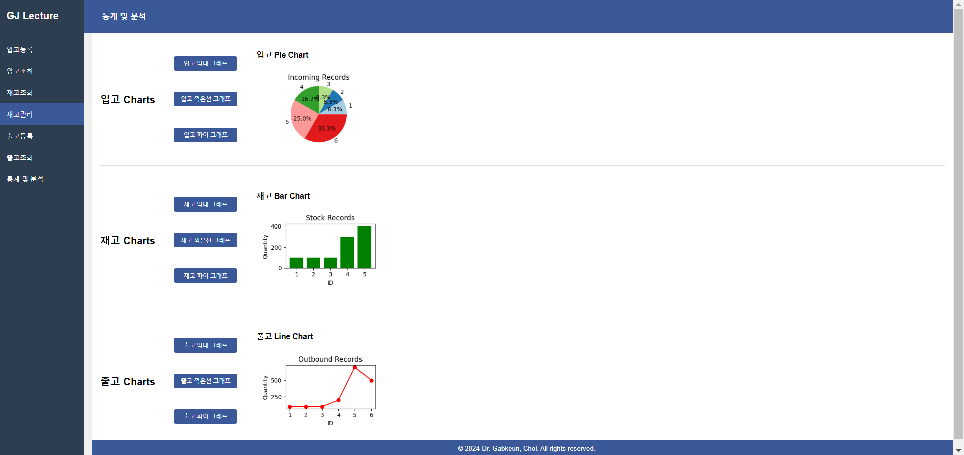
오늘은 WMS(Warehouse Management System) 수업 마지막으로 통계를 분석하여 시각화하는 공부를 하였다. 예전에 데이터 분석 공부를 잠깐 해서 시각화를 몇 번해봤었는데 오늘처럼 웹으로 시각화한 것을 올린 경험을 처음이다. 시각화한 것으로 웹에 띄우니깐 더 재미있었다. 아직 분석 코드를 이해를 못 했지만 추후 반복연습을 통해 데이터 분석 코드를 공부해야 될 것 같다.
'Python > Flask' 카테고리의 다른 글
| [Day 11] Docker 설치, 사용자 등록 및 사용법 (0) | 2024.07.27 |
|---|---|
| [Day 10] WMS(Warehouse Management System) 구성 및 요구 사항 정의 5 (0) | 2024.07.27 |
| [Day 8] WMS(Warehouse Management System) 구성 및 요구 사항 정의 3 (4) | 2024.07.24 |
| [Day 7] WMS(Warehouse Management System) 구성 및 요구 사항 정의 2 (2) | 2024.07.23 |
| [Day 6] WMS(Warehouse Management System) 구성 및 요구 사항 정의 1 (2) | 2024.07.23 |


